You're here:
How to Increase Conversion Rates at Checkout
So much has been written online about best practices for increasing checkout conversion rates. So. Much. But we wanted to cut through the noise. This post includes everything you need to know and nothing you don’t. Whether you run an e-Commerce or SaaS business, here are the three main pillars for getting your customers to actually click Purchase, Subscribe, Confirm, or Pay Now.
- Design fixes
- Feature fixes
- Performance fixes
We’ve studied the studies, read all the guru blog advice, and gained experience from revamping and launching our very own Quaderno Checkout feature.
Here is what we’ve learned.
The Problem with Checkout Conversion
Like with any good plan of action, let’s outline the problem first. Our goal is to increase the checkout conversion rates for digital products, but the problem is this:
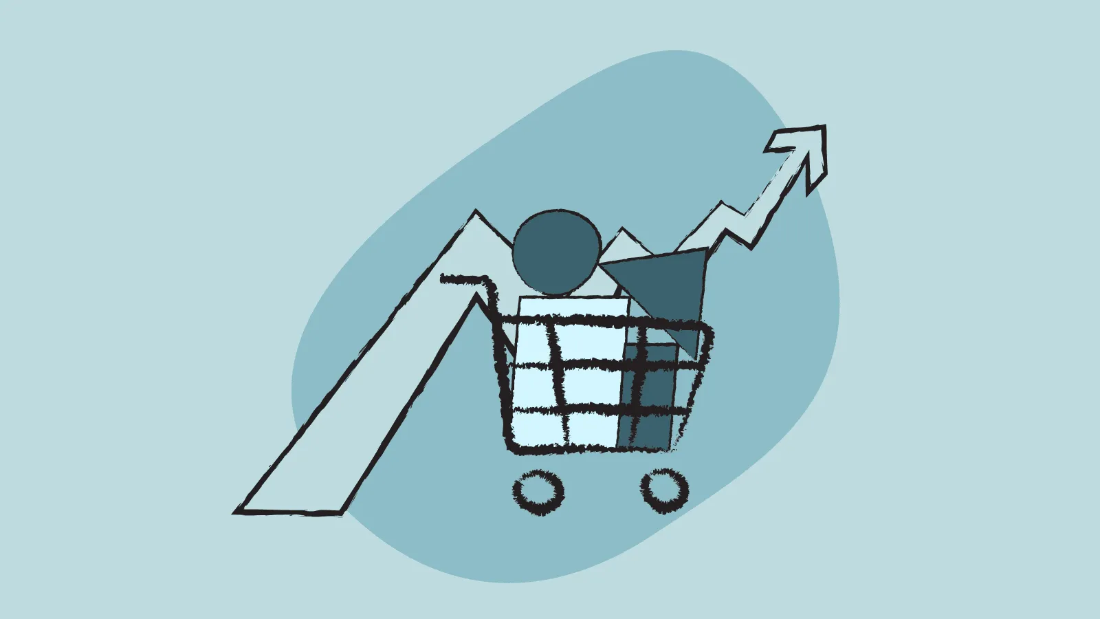
Nearly 70% of online shopping carts are abandoned.
Why do potential customers abandon their carts, just moments from buying your product?
Sometimes, customers just aren’t actually ready to buy. That’s fair. We’re all consumers and understand the hemming and hawing that can lead up to a purchasing decision.But the other reasons for cart abandonment are on you. They’re your responsibility and in your power to solve.
Take a look at these reasons compiled by the Baymard Institute:
Source: The Baymard Institute. https://baymard.com
We can generally lump these complaints into three thematic problems:
- Extra fees shown too late. For digital products, this is mainly just taxes.
- Too many steps requiring too much information from the customer.
- Poor page performance. (i.e.- SLOW, or just seems untrustworthy)
All of these user complaints amount to what we in the startup world call “friction.” If it takes too much time or too much thinking, it’s friction. You want to minimize and mitigate friction as much as possible, especially at the crucial point of purchase.
Below are proven tactics to reduce friction and increase checkout conversion rates for digital products. Have a read, see what might work for you, and most importantly — test it out! Conversation rates for ecommerce, mobile, etc.
Three Pillars of Increasing Checkout Conversion for Digital Products
Design-related fixes
There are a few well-documented “design patterns” for e-Commerce and SaaS checkout pages, based on consumer behavior. These focus on the visual appearance and UX of the page itself: what a customer sees, what they can click on, and what they feel when they do both of those things.
#### 1. De-clutter the page and limit the amount of information you ask from the user.
Remember it’s not about what’s actually there on the page, it’s about what the customer perceives is there. Your checkout form may truly only ask for the necessary information, but a cluttered, busy design can make the customer think, “Wow, there’s a lot going on here. I don’t have time for this.”
How to declutter?
Reduce form fields. Determine what information you actually need from the customer. Then organize it to appear the least imposing as possible.
- You can consolidate some information into one field, such as full name and address.
- Does your payment processor automatically detect what kind of credit card the customer is using? Great. Throw that field out.
- Use smart forms that populate the city, state information, etc. from the zip code alone.
- Leverage Google auto-fill in forms to help users checkout faster.
- need VAT ID or other tax IDs for B2B* / information buttons?
Remove navigation. This has the dual benefit of looking cleaner — less imposing — and limiting opportunities for the customer to click away from the checkout form. Links to other parts of your website aren’t staring them in the face, piquing their curiosity at the last second, reminding them that there are other places to be on the web.
Don’t include other product promotion or customer reviews. The checkout page is not the place to convince the customer to buy; it’s the place to make buying as straightforward as possible.
- If you want to recommend other products to your customer (e.g. an Amazon-like “Other products like this...” section) or if you want to attempt on-page upsells, do that stuff earlier on in the conversion funnel. Once the customer is so close to giving you their money, don’t muddle with their decision.
- Similarly, if a customer is already on the checkout page and poised to purchase, you don’t need to display customer reviews. Move them to an earlier stage where they can be effective, not distracting.
2. Emphasize security
Absolutely mention that the payment is secure. Put your security on display. Of course, it’s only ethical to do this step if your payment system is actually secure!
- Name the payment gateways you’re using and the measures you have in place.
- You can even include a generic lock icon, which will instantly convey to users that they don’t need to worry about their financial data.
#### 3. Keep checkout top of mind and easy to get to
This design tip takes place off the checkout page itself, but is just as relevant as any other! Throughout the rest of your website or online store, provide links to the checkout page. Checkout should always be “in sight” and just one click away.
- For an online store, implement a “persistent shopping cart” a clickable cart icon, usually placed in the top right, that shows the user what they’ve reserved for purchase.
- For a SaaS product, put a persistent “Sign up” or “Free trial” button in the top right.
- You can embed other ways to get to checkout within the actual content of your product pages.
4. Mention taxes before the final checkout page
This is straightforward. It’s also the fix for the #1 complain listed above: unexpected high fees. Somewhere earlier in the funnel, you should mention that tax will be added to the final cost of the product. When you’re selling digital products to customers around the world, it’s nearly impossible to predict the tax rate or tax amount on each sale. So a blanket solution could be to simply add “+ sales tax” in the product descriptions, like this:
Feature-related fixes
You’re used to thinking about features when it comes to your product. Now pay a little of that mind to your checkout page! How do your customers want it to work? Well, here are the answers based on the Baymard Institute’s ongoing reports.
1. Provide flexible payment options
Customers want options, especially when they’re shopping online. And as a business owner, you should offer as many digital payment options as you can.
- Various credit cards.
- PayPal. PayPal combines both the security and the flexibility that buyers want. Their financial details are safe, plus they can select from different cards or bank accounts.
- Other popular payment gateways. For example, at Quaderno we offer integrations with Stripe, Braintree, and GoCardless.
2. Offer a “Checkout as Guest” option
This feature fix might be old news, but it’s worth including and repeating here! It’s the second most common complaint cited in the graph above:
“The site wanted me to create an account.”
Here’s where buyer and seller interests are really at odds.
You want to take advantage of having this customer’s attention. You want to collect all of their information to establish a relationship. You want nurture them as a bonafide lead and convert them into a long-time customer. You want to do this by forcing them to create an account, password and all, before they can even make their first purchase.
This is the wrong approach, because — surprise! — buyers actually just want to buy what they came for. They don’t want to worry whether you might spam them. Forcing visitors to create an account puts up a wall that many just aren’t willing to climb. So give visitors the option to checkout as guests, and then remind them about creating an account (and the benefits entailed) once the purchase is complete.
Performance-related fixes
Last but certainly not least, we have fixes related to the technical performance of your website and checkout page. Just as much as online shoppers want options, they want those options quickly and without hassle.
1. Keep the page speed high
A slow loading time is a fast killer of the checkout conversion rate. You may not think fractions of a second really count here, but they do! Around 50% of surfers on the web expect sites to load in 2 seconds or less. Any longer, and the visitor might abandon their cart. (Not to mention a fast, well-functioning website builds more trust and gives a better impression of whatever digital product you’re offering!) How to fix this exactly? Kissmetrics offers information on ways to decrease your load time and, as a result, increase your conversion rates.
2. Stay mobile ready
This may also be a no-brainer, but given that mobile accounts for over 60% of e-Commerce traffic, we couldn’t leave it off the list! Your entire site, from search to checkout, should be mobile ready. Responsive web design will ensure that no matter where you customer is finding your products (e.g. a desktop, smartphone, or tablet from any manufacturer), their experience will be smooth… and will lead them to an easy purchase.What exactly is included in “mobile-friendly” design for digital businesses? Well, it actually includes a lot of the fixes mentioned above, now intended for the smartphone surfing experience. The Next Webcame up with a quick checklist:
- Layout and design must fit the small screen, with navigation spaced so the user can easily click where they want without accidentally hitting an unintended button.
- Keep the steps to complete a transaction at a minimum.
- It must be easy to find the action buttons: Buy, Call, Sign up, for example
- Images must be compressed correctly to speed-up site loading.
- User engagement should be designed for touch screens with swiping, scrolling or tapping.
What to do next
Even once you’ve optimized your checkout process, there will always be visitors who click away from the page and leave behind an incomplete purchase. The next phase of increasing your checkout conversion rate is to attract those wayward customers back to your site, and to encourage them to finish what they started!
The most effective follow-up is retargeting ads. This “re-acquisition” method tracks visitors across the web. When these former visitors (and potential customers) search for a keyword similar to your business’, your banner or pay-per-click ad will appear. Your retargeting ads can appear on other websites and on social media platforms, like Facebook and YouTube. Outsourcing your online advertising needs to any ppc advertising agency will save you time and ensure fewer mistakes.
If you’re curious about how to get those would-be customers to circle back to your site, then stay tuned to the Quaderno blog! We’ll go in-depth on these tactics in another post.
Note: At Quaderno we love providing helpful information and best practices about taxes, but we are not certified tax advisors. For further help, or if you are ever in doubt, please consult a professional tax advisor or the tax authorities.